Feeds:
Posts
Comments

Archive for the ‘Color Inspiration’ Category

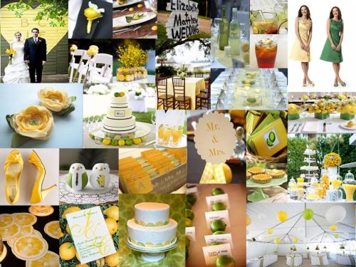
It’s been a little inspiration board crazy around here for a while…but hey, who doesn’t love a little color in their lives? Today’s fresh and summery board is for Bethe, one my oldest and best friends. She’s getting married this summer in an outdoor setting, with a theme of lemons and limes and Southern goodness. Lemon and lime were born to be together, and the added touch of some down-home southern style makes this wedding one that anyone would want to be invited to! Makes me want some sweet tea just thinking about it!

I think the look isย  fresh, inviting, and fun, just like Bethe and Isaac. I can’t wait to see how their vision turns out! I’m hoping Bethe will let me do a feature on their fabulously budget-friendly Southern citrus wedding…stay tuned! ๐Ÿ™‚

Read Full Post »

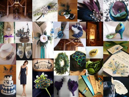
I promised you a comparison for the “Anthropologie meets Steampunk” board, and here we have it! While it’s decidedly less steampunk, and way more peacock, I think it still carries much of the vibe that Crystal’s friend is going for. So why the colorful bird? With the groom’s last name being “Peacock,” it’s almost criminal not to design your wedding based around the beautiful bird…especially when the colors and options are so dreamy! While I left out the steampunk element so as to not overwhelm the elements (although the quirky cake topper second down from the top left definitely has that vibe), this board is still very Anthropologie, a bit heirloom, and has a punch of modernity in some funky hand-painted shoes (second down from the top right) and a very modern-style cake (on the bottom left).ย  Instead of chartreuse, we’re going with a more kelly green, along with deep purples, and of course the navy. I am really loving these colors together and I think they are a perfect fit for the rustic barn the wedding is being held in (pictured top left).

So, what’s the word? Anthropologie meets feathery friend? Anthropologie meet steampunk? Neither?

Read Full Post »

I received a request the other day from Crystal, who is so generously helping her best friend plan her June 2010 wedding in San Miguel, CA (what are best friends for if not to help you plan one of the biggest days of your life?!). Anyway, she isย  in desperate need of some color inspiration for her friend’s wedding at the gorgeous barn on the Grand Cheniere Ranch.

The bride and groom are going for an “Anthropologie meets steampunk” vibe, with an heirloom, yet modern feel. Sooo…what exactly would that look like? Well, for those who aren’t “in” on the whole “steampunk” thing, think 19th century fantasy, with elements of fictional technological inventions like those found in the works of H. G. Wells and Jules Verne. The bridesmaids dresses have already been selected from Ann Taylor in a gorgeous navy blue color. Crystal suggested chartreuse, which I love. But to add more of the heirloom, rustic feel, I think tones of ivory/vanilla would look just gorgeous. But enough of the chatter, here are the goods!

For the steampunk element, I love the idea of hanging bare lightbulbs, along with incorporating elements of old timepieces and gears. The “Save the Date” tag pictured on the bottom center also gives off a 19th century vibe, perfect with this theme. I suggest bringing in the “Athropologie” feel with bright green grasses, flowy and lacy fabrics, heirloom jewelry, and vintage (or vintage-looking) shoes. The chartreuse gives a modern punch in itself, but do so even more with a cake with modern lines (like the one pictured with fondant gears), a clean and simple invitation, and the sleek simplicity of the bridesmaids dresses. I absolutely love the luminary table numbers pictured on the bottom, second from the right, with the subtle gear-like effect highlighted by the glow of tea lights. These can be found on etsy here.

I think these colors are awesomely perfect for the vibe that Crystal’s friend is going for. But how can one be absolutely certain without something to compare against? The answer? Not very. I have another idea for this eclectic wedding that has something to do with the fact that the groom’s last name happens to be “Peacock.” I just can’t resist. ๐Ÿ™‚ In the meantime, what do you think of navy, chartreuse, and ivory?

Read Full Post »
It’s been a while since my last color inspiration post, so I thought it was about time for another…but this time, it’s not for a friend, it’s not from a reader request, it’s not even just for fun…it’s for me! That’s right people, I’m getting married to that sweet little (I mean, huge and manly) man who is convinced we need meat and cheese platters as centerpieces…well, we’ll see about that. But first things first- colors! Adam and I are planning a spring 2011 destination wedding in Puerto Vallarta! Woo! And true to form, we’re going to do it on a budget…if it kills us. But more on that journey later. Back to colors. The first color combination that popped in my head for a Mexican wedding is aqua and orange…blue for the ocean and orange for the magnificent sunsets…and both for the Mexican culture in all of its bold color awesomeness. Soooo, here’s my first attempt. Does it say, “Bring me a margarita!” or “Take me back to the states!”??


*Don’t forget! Do you need some color inspiration? Email me with your ideas and I’ll feature an inspiration board for you on my blog! ๐Ÿ™‚

Read Full Post »


Today I have for you Option 2 for my friend Alicia’s 2010 Arizona wedding. If succulents aren’t perfect for an AZ wedding, I don’t know what are! When I heard Alicia’s bridesmaid dresses were slate color, my mind automatically went to yellow. Yellow and gray are so popular right now. But throw in the beautiful muted greens ofย  various succulents (and the fact that Alicia isn’t the biggest fan of flowers), and you have a color palette that is fun, sophisticated, and totally stylish. I love love love how well the yellow billy balls plays against the textures of the succulents. So, what do you think? Slate, hot pink, and creamsicle? Slate, yellow, and green? Neither? What colors do you see when you think “fun, outdoor, Arizona wedding?”

p.s. Need color inspiration? E-mail me! andreaskaar@gmail.com ๐Ÿ™‚

Read Full Post »


Today’s board comes to you inspired by one of my ASU sorority sisters who’s getting married next May in Peoria, AZ (congratulations Alicia!).ย  Her bridesmaid dresses are a luminescent slate color, just dying for bright, summery colors to pop against it. I remember the sunsets in AZ…orange, pink, and all around gorgeous. Now, hot pink can be a little…harsh. But played against the creamsicle orange and silvery gray, the pink is toned down, yet still provides the “pizazz,” if you will. I love how this board turned out…but I have another color scheme in mind that I want to show her (and you!)…just to make the decision even more difficult (or easier!). Stay tuned! ๐Ÿ™‚

Read Full Post »

And the winning combination for my indecisive friend is a combination of chartreuse, teal, brown, and yellow. Personally, I think she made the right choice.ย  I love the sophisticated, summery feel to it. And I’m pretty sure her fiance appreciates the yellow over “girly” coral ๐Ÿ™‚

Here’s the inspiration board that drew her in. What do you guys think? Is it the right decision?

p.s. As always, I’m here for your inspiration board needs. Do you have a color scheme (or two? or three or four?) that you’d like to see put into an inspiration board? Just e-mail me at andreaskaargmail.com with your ideas and I’ll get right to it! ๐Ÿ™‚

I’m off on a sunny vacation for a week (escaping the rainy NW for a while), but I’ll be back next week with more cheap and chic ideas for you! Stay tuned! ๐Ÿ™‚

Read Full Post »

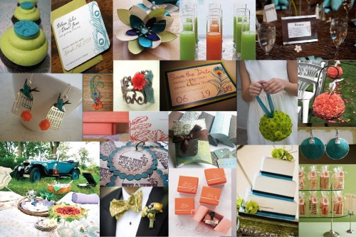
Per request of a beautiful bride to be, this morning I have for you a gorgeous combination of colors for an August 2010 wedding. At first she thought she wanted just teal, brown, and chartreuse…but then asked me to add in coral for a fun pop of color. I really love how it turned out. What do you think? To coral or not to coral? ๐Ÿ™‚

chartreuse, coral, teal, and brown

Read Full Post »

It’s been a while since I’ve given you another inspiration board to stir up your color scheme…so without further ado….

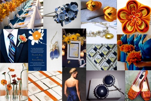
navy, orange, and yellow

Orange is a color you always think of when thinking of fall…navy and yellow might not be. But when I look out my window on this November day, all of these colors are present and working oh-so-well together. The oranges and yellows of the falling leaves play perfectly against the dark blue sky of the fall season. I absolutely love it! What do you think about this color combination for a fall wedding?

Read Full Post »

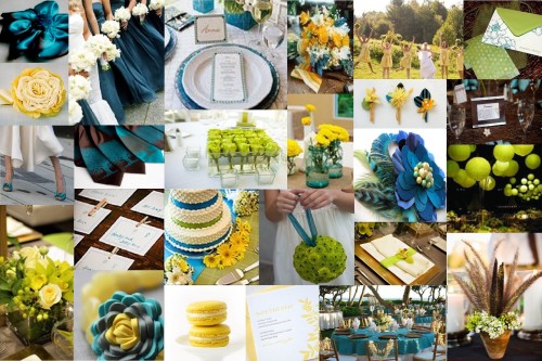
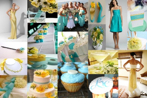
aqua and yellow
Ahhh, more bright and flirty color combos to get your wedding wheels a turnin’. I love aqua and yellow together. It’s fresh, it’s clean, it’s fun…and it’s perfect for Spring or Summer. Makes me want a lemon drop just thinking about it. Enjoy! ๐Ÿ™‚

Sidenote: If youโ€™d like an inspiration board to help you with your vision for your wedding, but donโ€™t have the time/know how to do it, Iโ€™d be happy to help! Leave me a comment and Iโ€™ll be in touch asap.

Read Full Post »

Older Posts »